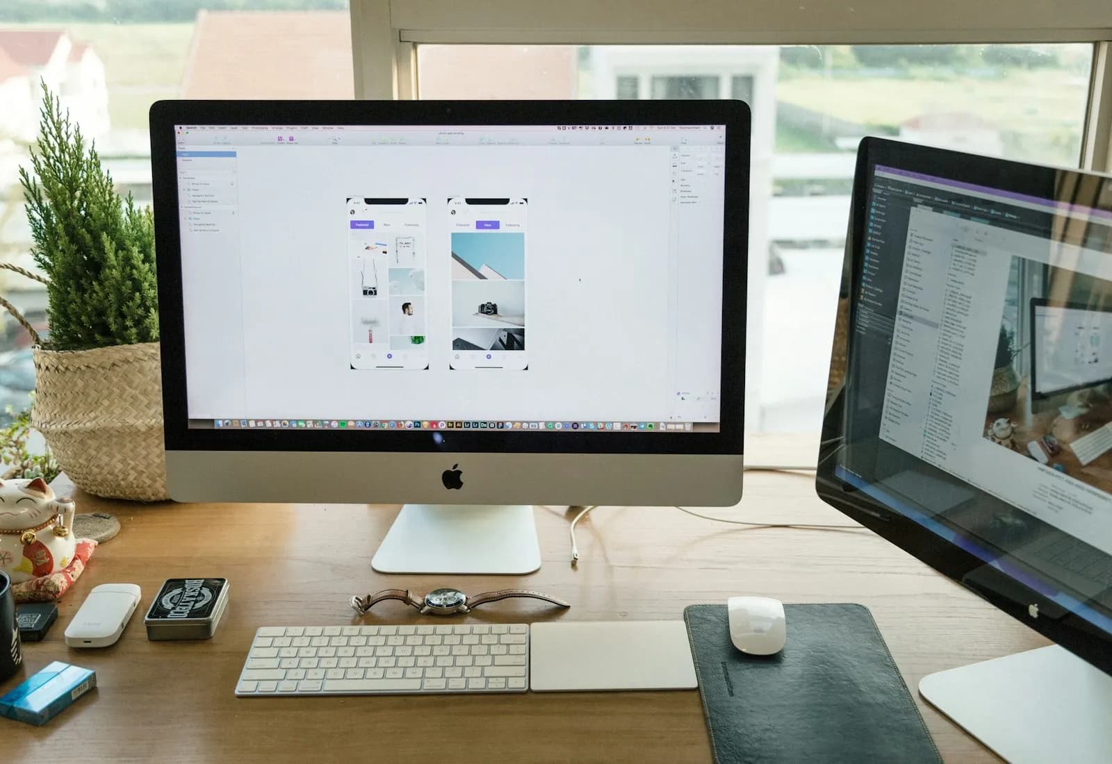
Design trends matter not because you should chase what's fashionable, but because they reflect evolving user expectations. When US visitors arrive at your website, they've already seen thousands of other sites. They arrive with standards, and a site that feels dated signals that your business might be too. Here's what's working in 2026.
Clean minimalism with clear hierarchy
US users have zero patience for cluttered interfaces. The most effective business websites in 2026 follow a single principle: show less, communicate more clearly. One primary call-to-action per section. White space that guides the eye rather than fills it. A clear H1 → H2 → body hierarchy that lets someone scan the page in 8 seconds and understand exactly what you offer and who it's for. Minimalism isn't about removing content. It's about removing everything that dilutes your message.
High-contrast CTAs
Your call-to-action button needs to be the most visually dominant element on the page, not one of five competing buttons. Blue, green, and orange buttons on light backgrounds consistently outperform subtle, on-brand alternatives in A/B tests. Button copy matters as much as color: "Get a free quote" converts better than "Learn more," which converts better than "Submit." On mobile, buttons should be at least 44×44 pixels for reliable thumb tapping. Anything smaller adds friction to every conversion.
Trust signals positioned above the fold
US customers are appropriately skeptical. They've been burned by businesses that overpromised. The best-converting sites address this skepticism before a visitor scrolls. A real review count with a star rating (linked to Google or Clutch, not a badge you designed), a specific metric ("21-day delivery" beats "fast delivery" every time), or recognizable client logos: these signals answer the question "why should I trust you?" before the visitor has to consciously ask it.
Mobile-first design, not just mobile-friendly
More than 60% of US web traffic is now mobile. "Mobile-friendly" means your desktop site scales down acceptably. "Mobile-first" means you designed for the phone first, then expanded to desktop. The difference shows up in navigation patterns, button placement, font sizing, and load performance on cellular connections. Test your site on an actual iPhone or Android device, not just a browser simulator, since the experience is often dramatically different.
Speed as a visible experience
Users don't consciously think "this site is fast." They feel the confidence it creates, or the hesitation when it isn't. In 2026, a sub-2-second load time on mobile is a table stake, not a differentiator. Sites built on legacy infrastructure or overloaded with tracking scripts simply cannot compete. If you're running a site on shared WordPress hosting from 2020, your competitors on modern stacks are winning the speed comparison before a visitor reads a single word.
Social proof where decisions happen
Testimonials buried at the bottom of the homepage are decoration. Social proof placed strategically, next to a pricing table, beside the main CTA button, or on service pages near the quote request form, actively reduces purchase anxiety at the exact moment a visitor is deciding whether to act. Specificity converts better than superlatives: "Our e-commerce revenue doubled in the first month after launch" is worth ten times more than "amazing service."
One thing that hasn't changed: the fundamentals still outperform trends. Clear headline → specific value proposition → proof → CTA. A site that nails this in plain HTML will outconvert a visually stunning site with a muddled message.
More articles

How Long Does SEO Take to Work? A Realistic Timeline for Small Businesses

Technical SEO Checklist: 15 Issues Quietly Capping Your Rankings
How Much Does SEO Cost for a Small Business in 2026? (Real Pricing Guide)

Web design for roofing companies: what actually turns storm leads into signed jobs.
PinexaDigital
Web design and SEO agency helping US businesses grow online. We write about web design, SEO, e-commerce, and digital growth for business owners who want honest, actionable information.
Keep reading
Related articles.

10 Signs Your Small Business Website Needs a Redesign.
A website doesn't announce that it's costing you customers. Ten concrete signs it's time for a redesign, and which ones to fix first.
August 7, 2026

How to Choose a Web Design Agency: 7 Questions to Ask Before You Hire.
Every agency's portfolio looks polished by the time you see it. Seven questions that actually separate a good agency from a bad one, and what a good answer sounds like.
August 3, 2026
How much does a website cost in 2026?
A transparent breakdown of web design pricing, from DIY builders to custom agencies, and how to decide what's right for your business.
July 9, 2026